

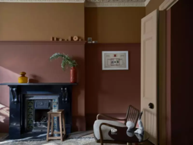
More than just a feature wall, gradient painting injects unique personality into a room. A collaboration between Farrow & Ball and artist Carol Bove at the Guggenheim Museum offers fresh inspiration for homeowners seeking dramatic and sophisticated color schemes.
The Art of Gradient Painting
Innovative design trends often emerge from the hospitality industry, where boutique hotels and restaurants create unique interiors that break away from conventional styles. These spaces inspire homeowners, as seen with hotel-chic bedrooms and spa-inspired bathrooms. However, it is rarer for modern art to become the catalyst for new paint approaches in residential settings.
A recent partnership between British paint manufacturer Farrow & Ball and American artist Carol Bove at the Guggenheim Museum in New York has sparked a fresh interpretation of color in homes. Joa Studholme, Farrow & Ball's Color Curator, collaborated with Bove to develop custom colors that transformed the museum's rotunda walls into an integral part of the exhibition. The result is a graduated color scheme of grays, starting with a deep hue on the ground floor and gradually lightening as it winds up the spiral.

Bringing the Concept Home
“Carol Bove’s team and the Guggenheim approached us to help bring the artist’s vision of a graduated ribbon of color to life,” Studholme recalls. “We created over 20 custom colors that connect each signature color to the next in a seamless transition as you move up the iconic rotunda.”
Seeing the bold effect in a large public space led Studholme to explore how gradient color schemes could work in domestic settings. The key is using colors from the same family to create harmonious transitions. While there are no strict rules, Studholme recommends using at least three colors, with larger spaces allowing for more.
Color Palette Possibilities
According to Studholme, the possibilities for gradient color schemes are endless. “Warming earth tones from deep Tanners Brown to glowing Stirabout work well, as do neutrals. But my favorite is graduating from rich Preference Red through Dead Salmon to Scallop,” she says. (Note: “Dead” in Dead Salmon refers to the matte finish, not an expired fish.)
Blue can be a bold option for living rooms, but when layered in different intensities, it creates a calming ambiance. Similarly, various shades of green can beautifully accent windows and seating areas.
Application Tips
There is no single way to apply gradient colors, as all tones belong to the same family, offering flexibility. However, Studholme cautions that “the gradient is much enhanced when the strongest color is used at the bottom to ground the room, with lighter colors above to open the space. The lightest tone should be used on the ceiling to unify the design.”
This approach ensures that the ceiling feels intentional rather than an afterthought, creating a cohesive and polished look. Gradient painting, inspired by modern art, offers homeowners a unique way to express personality and style through color.