


Politics

Toronto Man Charged in Rexdale Murder; Suspect Arrested in Mississauga Stabbing
Anthony Taylor, 28, was fatally shot in Rexdale. Ernest Gyamfy faces second-degree murder charges. Also, Jerome Edwards charged in Mississauga stabbing.


Business
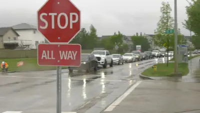
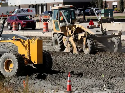
Edmonton Removes New 4-Way Stop After Traffic Snarl in Southeast
Edmonton city officials removed a newly installed four-way stop in the Maple neighbourhood after severe traffic backups. The decision came following resident complaints and video evidence of congestion.


Sports

Kitchener Rangers Fans Celebrate Memorial Cup Victory at Homecoming
Hundreds of fans gathered to welcome the Kitchener Rangers home after their Memorial Cup win. The team returned to a hero's welcome with celebrations.


Lifestyle

Teen Girl Accused of Stabbing Three Horses at Las Vegas Racing Event
A teenage girl was arrested for allegedly stabbing three horses at a Las Vegas racing event. The horses are safe, but the suspect faces multiple cruelty charges.


Health


Environment
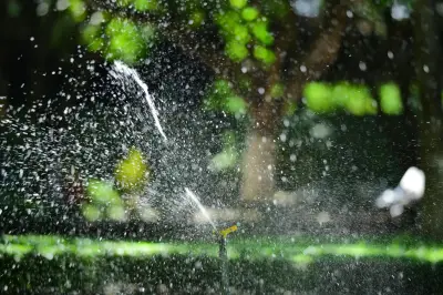
Metro Vancouver Tighter Water Restrictions Next Week
Metro Vancouver will implement stricter water restrictions starting next week due to drought conditions, affecting residential and commercial water use across the region.
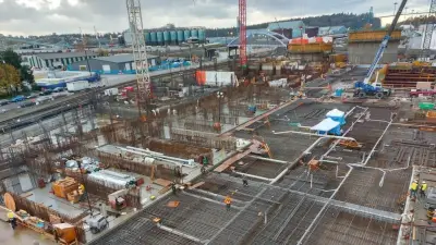
Metro Vancouver Reviews Wastewater Plant Costs Hit $3.86B
Metro Vancouver announces a review of the North Shore Wastewater Treatment Plant, whose costs have ballooned to $3.86 billion, raising concerns over budget and timeline.
Yellowhead Trail Closed Due to Heavy Rain Flooding
A section of Yellowhead Trail in Edmonton is closed after torrential rain caused flooding. Motorists are advised to use alternate routes as crews work to clear the water.

Tesla Sues Manitoba Government Over EV Rebate Exclusion
Tesla Motors Canada has filed a legal challenge against Manitoba's government after being excluded from the province's electric vehicle rebate program, citing substantial and unjustified harm.
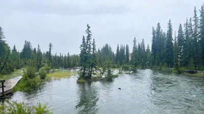
Canmore Flooding Less Severe Than 2013, Experts Say
Experts say flooding in Canmore is minor compared to 2013, as rainfall warnings continue in Calgary. Streets are affected but no major damage reported.